In the fast-paced world of digital retail, getting a customer to add an item to their cart is only half the battle.
The true test of your online store’s effectiveness happens at the final hurdle: the checkout process. Unfortunately, this is where most e-commerce businesses lose a massive chunk of their potential revenue. Studies consistently show that the average shopping cart abandonment rate hovers around 70%. That means out of every ten customers who decide to buy from you, seven walk away before completing their purchase.
Why does this happen? In most cases, it boils down to e-commerce checkout problems that create friction, frustration, or doubt in the buyer’s mind. From sluggish loading times and complicated forms to unexpected shipping fees and payment gateway failures, checkout errors are the biggest silent killers of online sales.
For e-commerce business owners, digital marketers, and startup founders, checkout optimization is not just a technical necessity-it is a critical strategy for survival and growth. By identifying and resolving these friction points, you can implement powerful cart abandonment solutions that drastically improve your online store conversion improvement metrics.
In this comprehensive guide for TheCconnects Magazine, we will break down the 15 most common e-commerce checkout errors, explore why they happen, and provide practical, actionable solutions you can implement right now to rescue your revenue and delight your customers.
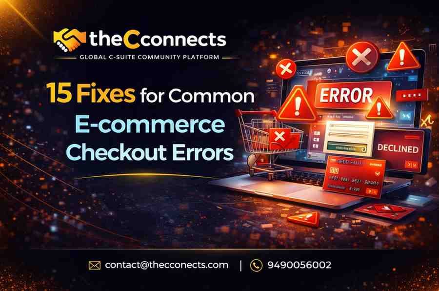
The 15 Most Common E-commerce Checkout Errors (And How to Fix Them)
1. Hidden Costs and Unexpected Charges
The Problem:
The customer adds a product to their cart, initiates the checkout, and suddenly sees a drastically inflated total price due to shipping fees, taxes, or handling charges. Shocked by the final number, they close the tab.
Why It Happens:
Businesses often try to make product prices appear as low as possible on the catalog pages, delaying the reveal of necessary operational costs until the very end of the funnel. This destroys customer trust.
The Solution:
Transparency is the best conversion strategy. Be upfront about shipping costs from the moment a user lands on your site. If possible, offer a flat shipping rate or build the shipping costs into the product price to offer “Free Shipping.” Alternatively, integrate a shipping calculator right on the product page or in the initial cart view so customers know exactly what they will pay before they start typing in their personal details.
2. Forced Account Creation
The Problem:
A new customer is ready to pay but is blocked by a mandatory prompt demanding they create an account, verify their email, and set up a password before they can buy.
Why It Happens:
Store managers and digital marketers want to capture customer data to build their email marketing lists and encourage repeat purchases. However, prioritizing your marketing needs over the customer’s immediate desire to purchase creates massive friction.
The Solution:
Always offer a “Guest Checkout” option. Let customers buy what they want with just an email address and payment details. If you want them to create an account, ask them after the payment is complete on the “Thank You” page. You can incentivize account creation by offering order tracking or a small discount on their next purchase.
3. Complicated and Lengthy Checkout Forms
The Problem:
Customers are presented with a massive, multi-page form asking for irrelevant information like their fax number, company name, or secondary phone number. Exhausted by the sheer volume of fields, they abandon the cart.
Why It Happens:
Businesses use default checkout templates provided by their e-commerce platform (like Shopify, WooCommerce, or Magento) without customizing them to suit their specific audience, leaving unnecessary fields active.
The Solution:
Ruthlessly minimize your form fields. Only ask for the information absolutely necessary to process the payment and deliver the product. Combine the “First Name” and “Last Name” fields if possible. Provide a single checkbox that says “Billing address is the same as shipping address.” A streamlined, single-page checkout drastically reduces cognitive load and speeds up the transaction.
4. Slow and Sluggish Checkout Pages
The Problem:
After clicking “Proceed to Checkout,” the customer is forced to watch a spinning wheel for five to ten seconds. Assuming the site is broken or untrustworthy, they leave.
Why It Happens:
Checkout pages are dynamic and heavily encrypted, which requires more server resources. Add heavily unoptimized images, clunky third-party tracking scripts, or a poor web hosting environment, and the page speed plummets.
The Solution:
Optimize your checkout speed. Start by upgrading your e-commerce hosting to a dedicated or cloud-based server. Remove unnecessary third-party plugins or scripts from the checkout page. Use content delivery networks (CDNs) and ensure your images are compressed. Your checkout page should ideally load in under two seconds.
5. Lack of Multiple Payment Options
The Problem:
A customer reaches the payment section but realizes they can only pay via credit card. They prefer to use PayPal, Apple Pay, or a Buy Now, Pay Later (BNPL) service, so they abandon the purchase.
Why It Happens:
The store owner has only integrated a basic, single-channel payment gateway (like standard Stripe or a local bank API) to save on setup time or transaction fees.
The Solution:
Diversify your payment gateways. Modern consumers expect flexibility. Ensure your checkout includes standard credit/debit card options, digital wallets (Google Pay, Apple Pay, Amazon Pay), and trusted third-party gateways (PayPal). For higher-ticket items, integrating BNPL services like Klarna, Afterpay, or Affirm can significantly boost conversion rates by breaking down financial barriers.
6. Payment Gateway Failures and Vague Declines
The Problem:
The customer clicks “Pay,” but the transaction fails. The screen refreshes with a vague message like “Error 404” or “Transaction Failed,” offering no explanation of what went wrong.
Why It Happens:
Payment failures can happen due to API timeouts, bank declines, incorrect CVVs, or fraud filters. Vague error messages happen because the developer hasn’t configured the system to translate complex gateway error codes into plain English.
The Solution:
First, use reliable, modern payment processors with high uptime guarantees. Second, implement intelligent, human-readable error messages. If a card is declined because of an incorrect expiry date, the message should explicitly say, “The expiration date entered is incorrect. Please check your card and try again.” Providing clear instructions helps the customer fix the issue immediately instead of giving up.
7. Poor Mobile Checkout Optimization
The Problem:
A shopper trying to buy on their smartphone finds the text too small to read, the form fields difficult to tap, and the checkout button completely hidden off-screen.
Why It Happens:
The website was designed primarily for desktop users, and the mobile responsive design was treated as an afterthought, leading to clunky mobile user experiences.
The Solution:
Adopt a mobile-first design strategy. The majority of e-commerce traffic now comes from mobile devices. Ensure your checkout forms use large, legible fonts (at least 16px to prevent iOS auto-zoom). Make sure form fields are easy to tap with a thumb, use numerical keypads automatically for phone and credit card fields, and ensure the “Complete Order” button is sticky and always visible at the bottom of the screen.
8. Lack of Trust Badges and Security Concerns
The Problem:
The user is hesitant to hand over their credit card information because the checkout page looks basic, lacks secure indicators, or triggers browser warnings.
Why It Happens:
The site might be missing a valid SSL certificate, or the design might simply lack visual trust indicators, leaving consumers skeptical about how their sensitive financial data will be handled.
The Solution:
Secure your site with a robust SSL certificate (ensuring your URL shows “https” and a padlock icon). Visually reassure your customers by placing recognized trust badges near the credit card fields-such as Norton Secured, McAfee Secure, or logos of the accepted payment providers. Adding a brief note underneath the payment button stating “256-bit Secure SSL Checkout” can provide the psychological comfort needed to finalize the sale.
9. Distracting Website Elements During Checkout
The Problem:
While trying to fill out their payment details, the customer is distracted by top navigation menus, social media icons, footer links, or pop-up offers. They click away to browse more and never return to finish the purchase.
Why It Happens:
The checkout page uses the exact same header, footer, and layout as the rest of the website, providing too many “exit routes” for the buyer.
The Solution:
Enclose your checkout. Once a customer enters the checkout flow, remove the main navigation bar, search box, footer links, and any promotional pop-ups. The only clickable elements on the page should be the form fields, the support link, and the “Complete Purchase” button. Your goal is to keep them entirely focused on finishing the transaction.
10. Absence of Auto-fill and Address Validation
The Problem:
A customer mistypes their zip code or street name. The order goes through, but the package is shipped to the wrong address, resulting in chargebacks, lost inventory, and angry customers.
Why It Happens:
The checkout form relies entirely on manual data entry and lacks the technology to cross-reference addresses with postal databases.
The Solution:
Implement Address Auto-complete APIs (such as Google Maps Address Validation). When a customer starts typing their street name, the system should suggest accurate, verified addresses. Furthermore, enable browser auto-fill capabilities so returning customers or users with saved Chrome/Safari profiles can populate the entire form with a single click.
11. Unclear Delivery Times and Shipping Policies
The Problem:
The checkout simply says “Standard Shipping,” giving the customer no idea if the product will arrive in three days or three weeks. Anxious about timing (especially for gifts), they abandon the cart.
Why It Happens:
The merchant relies on default shipping labels without realizing that modern consumers, spoiled by Amazon Prime, demand precise delivery windows.
The Solution:
Replace vague terms with clear delivery estimates. Instead of “Standard Shipping,” use “Standard Shipping (Arrives by Oct 12 – Oct 15).” If you offer expedited shipping, clearly contrast the arrival dates. Providing exact expectations reduces buyer anxiety and pushes them closer to clicking the buy button.
12. Frustrating “Promo Code” Boxes
The Problem:
A customer sees a highly visible “Enter Promo Code Here” box right above the total price. They leave the checkout page to search Google for coupons, find expired codes, get frustrated, and abandon the cart entirely.
Why It Happens:
Standard checkout templates prominently feature discount code boxes, inadvertently signaling to the customer that they are overpaying if they don’t have a code.
The Solution:
Hide or minimize your promo code box. Instead of an open text field, use a subtle text link that says, “Have a promo code?” which expands into a box only when clicked. Alternatively, auto-apply discounts via URL links during marketing campaigns so the customer never has to manually type a code in the first place.
13. Lack of Real-Time Error Validation
The Problem:
A customer fills out a long form, clicks submit, and is then kicked back to the top of the page with a red message saying “Errors found,” forcing them to hunt for the field they messed up.
Why It Happens:
The site uses post-submission validation instead of inline validation, causing an incredibly frustrating user experience.
The Solution:
Implement real-time inline validation. As soon as a customer types an invalid email address (e.g., missing the “@” symbol) and clicks to the next field, a small red message should appear immediately beneath the email box. Green checkmarks should appear next to correctly filled fields, giving the user a sense of progress and preventing errors before the submit button is ever pressed.
14. Inadequate Customer Support During Checkout
The Problem:
A customer has a quick question about a product warranty or a return policy while on the checkout page. Unable to find an immediate answer, they leave.
Why It Happens:
Support channels are usually buried on a “Contact Us” page, forcing the user to abandon their checkout flow to get help.
The Solution:
Offer seamless, in-checkout support. Include a live chat widget (or an intelligent AI chatbot) specifically on the checkout page. Additionally, provide a short, easily accessible FAQ section right on the page (perhaps in a sidebar or a pop-up modal) addressing common concerns like return policies, secure payments, and shipping guarantees.
15. Failure to Retarget Abandoned Carts (The Safety Net)
The Problem:
A customer experiences a glitch, gets distracted by a phone call, or simply runs out of time and closes the checkout. The merchant makes no attempt to bring them back.
Why It Happens:
The store lacks an automated cart recovery strategy, treating lost checkouts as permanent losses rather than paused transactions.
The Solution:
Even with a perfect checkout, abandonments will happen. Fix this by setting up automated abandoned cart email sequences. Send the first email within 1-2 hours, gently reminding them of what they left behind. Send a second email 24 hours later, perhaps addressing potential objections (highlighting return policies or customer reviews). Finally, send a third email 48 hours later offering a small, time-sensitive discount to sweeten the deal.
Conclusion
Checkout optimization is an ongoing process of reducing friction and building customer trust. E-commerce checkout problems are not just technical inconveniences; they are direct barriers to your business’s financial success. By taking a proactive approach to auditing your store, you can identify hidden bottlenecks and implement these powerful cart abandonment solutions.
From eliminating surprise shipping costs and simplifying your forms to speeding up page loads and offering diverse payment gateways, every single adjustment you make serves to smooth the customer’s journey. Online store conversion improvement doesn’t happen by accident. It happens through meticulous attention to detail and a relentless focus on user experience. Implement these 15 fixes today, and watch your abandoned carts turn into completed sales and loyal customers.
Contact Us for Immediate Support
📩 Email: contact@thecconnects.com
📞 Call: +91 91331 10730
💬 WhatsApp: https://wa.me/919133110730