
Every paid campaign, organic search clicks, and email link that sends a prospect to your landing page is an investment, in money, time, and audience attention. What happens when that prospect arrives determines whether the investment produces a return or simply generates traffic statistics that nobody can act on.
The uncomfortable reality is that most landing pages underperform significantly, not because the offer is wrong or the targeting is poor, but because the page itself contains avoidable elements that create friction, undermine trust, or fail to communicate value with sufficient clarity and speed.
In an era of shortening attention spans, rising digital advertising costs, and increasingly sophisticated buyers who can evaluate credibility in seconds, the quality of your landing page is one of the highest-leverage variables available to any growth team. Small improvements in landing page conversion rates have compounding effects on the economics of every acquisition channel you run.
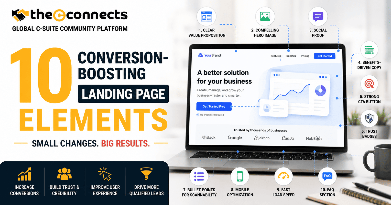
The 10 conversion-boosting landing page elements covered in this guide are grounded in current conversion rate optimization thinking, practical, tested, and immediately applicable to the landing pages your business is running today.
1. A Clear, Benefit-Driven Headline
What it is: The primary headline is the first full sentence or phrase a visitor reads, typically the largest text element above the fold. It is the most important copy decision on your landing page.
Why it matters: Research from Nielsen Norman Group on web reading behavior consistently shows that visitors scan rather than read, and the headline is the primary content that determines whether they continue reading or leave. A vague, company-centric headline fails the visitor’s implicit first question: “What’s in this for me?”
How to improve it: Benefit-driven headlines communicate the specific outcome the visitor will achieve, the problem they will solve, or the value they will receive, rather than describing your product or service’s features. “Generate 3x More Qualified Leads Without Increasing Ad Spend” converts better than “Our Lead Generation Platform” for the same audience with the same intent.
Mistake to avoid: Writing headlines that make sense to you but require context the visitor does not yet have. Test your headline with someone unfamiliar with your product, if they cannot immediately articulate what the page offers, the headline needs revision.
2. A Compelling Subheadline or Value Proposition
What it is: The supporting text immediately below the headline that expands on the headline’s promise, adding specificity, addressing the mechanism, or answering the implicit “How?” or “For whom?”
Why it matters: The headline creates interest; the subheadline earns continued attention. Together, they constitute the most concentrated value communication on the page, the two to three seconds that determine whether a visitor commits to reading further.
How to improve it: Use the subheadline to address the most significant piece of information the headline cannot carry, typically the mechanism, the audience specificity, or the time frame. “Join 2,400 growth leaders who used this framework to reduce CAC by 40% in 90 days” adds credibility, specificity, and urgency that no headline can compress into a single phrase.
3. One Strong Primary Call-to-Action
What it is: The primary call to action, the button, form submission, or link that represents the conversion event you want visitors to complete.
Why it matters: Landing pages with multiple competing CTAs consistently underperform those with a single, clearly prioritized conversion path. Every additional option creates decision friction that reduces the probability of the visitor taking any action at all.
How to improve it: Make the primary CTA visually dominant through contrast, size, and placement. Write CTA copy that describes the outcome rather than the action, “Get My Free Strategy Session” converts better than “Submit” for most offer types. Place the primary CTA above the fold and repeat it at logical decision points further down the page.
Example: A SaaS company replaces three different buttons (“Start Free Trial,” “Book a Demo,” “Learn More”) with a single primary CTA (“Start Your Free 14-Day Trial”) and a secondary text link for those not ready to commit, reducing decision paralysis and improving trial sign-up rates.
4. Trust Signals, Testimonials, Logos, and Social Proof
What it is: Credibility elements that demonstrate that other people or organizations, ideally those similar to your visitor, have trusted you and received the value you are promising.
Why it matters: Purchasing decisions, especially first-time interactions, are fundamentally trust decisions. Visitors who do not yet know your brand arrive with a default skepticism that trust signals directly address. The specific form of trust signal that works best varies by audience and offer type, but the absence of trust signals consistently depresses conversion rates.
How to improve it: Match trust signals to your visitor’s likely skepticisms. Client logos address “Is this organization legitimate?” questions. Specific testimonials with measurable outcomes address “Does this actually work?” questions. Reviews with star ratings address “What do people like me think?” questions.
Example: A consultancy adds three testimonials from named, recognizable companies, each addressing a specific outcome rather than offering a generic endorsement, and a row of client logos. Consultation request rates improve measurably across the following traffic cohorts.
5. A Focused Above-the-Fold Message
What it is: The visible page content before the visitor scrolls, which must contain sufficient information to create a reason to continue engaging, without requiring the visitor to hunt for context.
Why it matters: A significant proportion of visitors leave without scrolling. The above-the-fold section functions as the page’s preview, if it does not communicate value, relevance, and credibility immediately, the rest of the page’s content is never seen.
How to improve it: Ensure that the above-the-fold section includes your headline, subheadline, primary CTA, and at least one trust signal or proof element. Avoid the common mistake of using this space primarily for large hero images that communicate aesthetic rather than value.
6. A Simple, Low-Friction Lead Form
What it is: The form through which visitors provide their information to complete the conversion event, whether requesting a demo, downloading a resource, starting a trial, or booking a consultation.
Why it matters: Form friction, the perceived effort of completing a form, is one of the most direct and most measurable drivers of form abandonment. Every additional field increases the cognitive and practical barrier to submission.
How to improve it: Request only the information genuinely required for the next step in the customer journey. For initial lead capture, name and email is typically sufficient. Add fields only when they provide specific, necessary qualification value that justifies the conversion cost. Test multi-step forms for complex information requirements, breaking a long form into sequential steps consistently improves completion rates compared to presenting all fields simultaneously.
7. Strong Visual Hierarchy and Strategic Whitespace
What it is: The intentional organization of page elements, through size, weight, contrast, and spacing, that guides the visitor’s eye in a deliberate sequence from headline to value proposition to proof to CTA.
Why it matters: Visitors scan before they read. A page without clear visual hierarchy makes scanning difficult, requiring cognitive work that most visitors are unwilling to invest in an unknown page. Visual hierarchy removes that friction by making the most important information visually impossible to miss.
How to improve it: Apply a clear typographic hierarchy, primary headline, subheadline, body copy, and supporting elements each at distinct sizes and weights. Use whitespace deliberately to separate sections and prevent the cognitive overload that dense pages create. Ensure the CTA button is visually distinct from all surrounding elements through contrast.
8. Supporting Proof, Case Studies, Data, and Specificity
What it is: Evidence beyond testimonials, case studies, data points, usage statistics, analyst reports, or media mentions, that substantiates the claims your headline and value proposition make.
Why it matters: Claims without substantiation are easily dismissed by skeptical visitors who have encountered similar claims from competitors that did not deliver. Specific, verifiable proof transforms promise into credible expectations.
How to improve it: Wherever you make a benefit claim, consider whether there is a supporting proof element that can follow it. “Trusted by 10,000+ businesses” is stronger than “Trusted by many businesses.” “Average customer reduces time-to-hire by 35%” is stronger than “Faster hiring.”
9. Mobile-Friendly Design and Fast Load Speed
What it is: A page experience that functions correctly, loads quickly, and is easy to navigate on mobile devices, which now represent the majority of web traffic for most businesses.
Why it matters: Google’s mobile-first indexing and Core Web Vitals assessments connect page performance to both organic search rankings and paid advertising quality scores. More practically, visitors on mobile devices who encounter slow-loading or difficult-to-navigate pages abandon at significantly higher rates than those on desktop.
How to improve it: Test your landing page on multiple mobile devices and screen sizes. Measure Core Web Vitals through Google Search Console or PageSpeed Insights. Prioritize image optimization, script loading order, and server response time. Ensure that CTA buttons are large enough for comfortable thumb interaction and that forms are easily completable on a phone keyboard.
10. A FAQ or Objection-Handling Section
What it is: A structured section that anticipates and directly addresses the most common objections, concerns, and questions that prevent visitors from converting.
Why it matters: Visitors who have reservations they cannot immediately answer will leave rather than seek clarification. An objection-handling section converts the common hesitations, about pricing, commitment, technical requirements, or trust, into resolved concerns that no longer stand between the visitor and conversion.
How to improve it: Build your FAQ from actual objections your sales team hears, from customer support tickets, and from exit surveys. Prioritize the two or three objections that most frequently delay or prevent conversion. Write answers that are specific, honest, and directly acknowledge the concern rather than deflecting it.
Example: A B2B software company adds a FAQ section addressing “How long does onboarding take?”, “What happens after my trial ends?”, and “Do I need technical support to set up?”, three questions that sales calls revealed were common hesitations. Demo request rates improve notably in the following testing period.
Conclusion:
The 10 conversion-boosting landing page elements covered in this guide collectively address the most common and most fixable reasons landing pages underperform. None of them are particularly complex in concept, but each requires deliberate, informed implementation and ongoing testing to reach its potential.
The highest-converting landing pages in any category are not those that were built once and left unchanged. They are those maintained by teams that measure, test, and refine consistently, treating the page as a dynamic commercial asset rather than a static piece of web design.
Start with the elements that address your current biggest conversion gaps. Measure the baseline. Make targeted changes. Test the results. Repeat.
Contact TheCconnects
If you are a CRO specialist, UI/UX designer, digital marketer, growth strategist, web developer, or performance marketer with practical insights on landing page optimization, conversion psychology, A/B testing, or user experience design, TheCconnects would love to feature your expertise.
Whether you have real-world case studies, high-converting design strategies, lead generation frameworks, or actionable conversion optimization tips that help businesses turn more visitors into customers, your insights can bring valuable impact to our growing business audience.
Looking to publish your article, share your expertise, or collaborate with our platform? Reach out to us and become part of the conversation shaping the future of digital growth and conversion-focused marketing.
📧 Email: contact@thecconnects.com
📞 Phone: +91 91331 10730
💬 WhatsApp: https://wa.me/919133110730